15 Of The Worst Corporate Rebrands Ever
When I take my clients through a rebrand it begins with a clear understanding of how their brand is currently perceived and works toward clarifying what they want to be known for, how they differentiate from competitors, how they resonate with customers and how they want to be perceived. At the end of this process they may or may not decide that their current visual identity still communicates their brand essence. If they do change visual ID it’s a clear signal to the market that the organisation is changing. However, if the visual ID has massive equity because it is well known and signifies strong brand qualities and reliability you would be mad to make radical changes.
This article shows how change of visual identity may not be for the best.
15 Of The Worst Corporate Rebrands Ever
By Shaun Cleary
Rebranding is a process that many companies go through at one time or another and more often than not, the rebranding process is a huge success.
When rebranding is done right, companies not only see dramatic increases in sales but also, expose their brand to demographics that previously wouldn’t typically be associated with that company.
The problem is, rebranding is a difficult process. It’s more than just redesigning a logo or changing the colour scheme; it’s about conveying the message the brand wants to communicate in the most simple way possible. It’s for this reason that companies often spend millions of dollars on completely redefining their identity.
When it goes wrong though, it can be a PR nightmare as brands are often subjected to negative criticism and public outcry. Below, I’ve rounded up some of the worst corporate rebrands ever so you can see exactly what not to do when you’re rebranding your company.
Related Article: 20 iconic brands and why they work
1. Mastercard
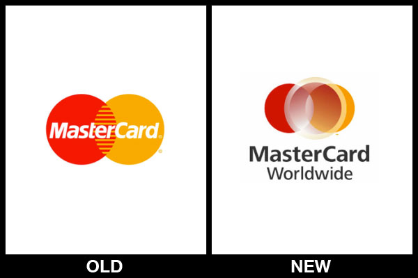
MasterCard’s original logo was probably one of the most iconic logo’s of the modern age, much like the current Visa logo. However, when MasterCard decided to rebrand a few years ago, things went terribly wrong as you can see.
Usually, when a company chooses to rebrand, the idea behind the process is to simplify an already iconic logo. MasterCard’s original logo was extremely simple. It featured two coloured circles which combined to create a Venn-diagram style logo. The new one appears to use three circles which does nothing to simplify the brand whatsoever.
Plus, the logo utilises shadows and gradients in the most poor way imaginable. There’s transparency too, which leads to a chaotic and unrefined look. There’s no doubt about it, this logo just isn’t as iconic as the original.
2. NBC Universal
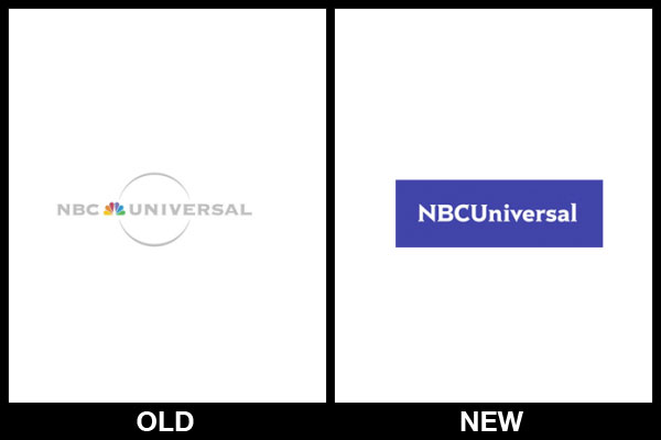
NBC Universal is yet another iconic brand that lost their marbles (or perhaps just their peacock) when it came to rebranding.
If you remember the original logo on the left, you’ll likely remember that the colourful peacock icon in the middle of “NBC” and “Universal” was rather iconic. In fact, it pretty much defined the brand around the world.
Strangely though, when NBC Universal decided to rebrand, they got rid of this part of the logo. It was replaced by a large purple box and a Times New Roman-esque font.
You can sort of see where they were going with this one. I mean, the purple coloured block does stand out a lot more than the rather basic original logo, but it just doesn’t have any character at all. Plus, they lost the only part of the logo that people actually remembered.
3. Tropicana
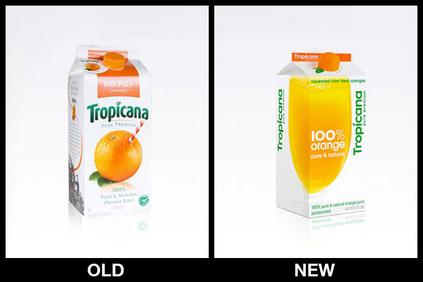
Tropicana is one of the most trusted juice brands around. The company sells millions of cartons of its orange juice every year but following the disastrous rebranding exercise a few years ago, their sales fell by 20%.
When Tropicana decided it was time for a rebrand, their intention was to make the brand appear more “down to earth”. With this in mind, they simplified the logo and packaging dramatically (as you can see from the image above) but unfortunately, it didn’t go down too well with customers.
Customers felt alienated by the brand and many of them passed-by without purchasing, simply because they didn’t recognise the packaging. In essence, this rebrand was too far removed from the original design.
If you go to the supermarket today and scan the shelves for a carton of Tropicana, you’ll probably think that we’ve made this rebrand up. This is due to the fact that after a huge 20% drop in sales, Tropicana abandoned this rebrand and reverted to their original design.
4. Pepsi
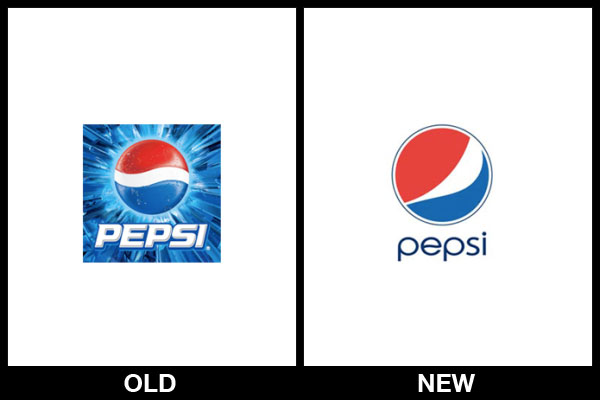
Pepsi is no stranger to a rebranding. In fact, over the past hundred years or so, they’ve rebranded their company countless times with varying results. Compare this to Coca Cola and you’ll see that Pepsi is a brand struggling to find an image for itself.
A few years ago, Pepsi hired a company to completely redesign the brand and after 5 months of hard work, they came up with this logo (the one on the right). Pepsi still uses this logo on their products despite being subjected to strong negative criticism from consumers and branding experts alike following the rebrand.
The logo itself cost Pepsi $1 million and many still believe that this was money down the drain.
5. Kraft Foods
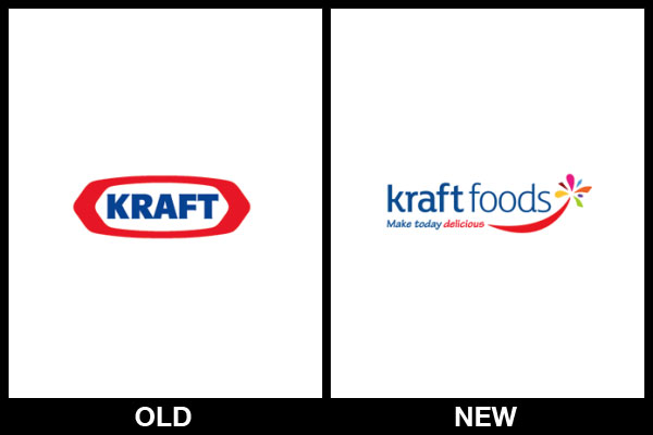
Kraft Foods is one of the world’s most well-known and iconic food brands and despite the fact that their original logo wasn’t the greatest logo ever, people all around the world knew of Kraft and the logo was, to some extent, an American icon.
Having made the decision to redesign the logo a few years ago, this is what Kraft came up with. While their old logo was simple, bold and stood the test of time, their new logo was a mish-mash of different colours, fonts and imagery.
The bulk of the logo utilised one font, while the slogan below utilised a completely different (and rather non-complimentary) font. Added to this was a “swoosh” and an unnecessary explosion of colour.
It was a terrible rebrand and a few months later, Kraft Foods reverted back to their original, iconic logo design.
Related Article: Rebrand, refresh or re-engineer?
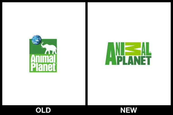
6. Animal Planet

Animal Planet is one of the most popular TV stations in the world and their animal-related programming is second-to-none. Their original logo (on the left) has been around a fair few years so the guys in charge decided it was time for a rebrand.
Now, the original logo is an example of good branding. It features the title of the TV station, an animal (the elephant) and of course, the planet. With the new logo though, everything apart from the station name has been removed which gives the logo absolutely no significance.
What’s more, the designers have opted for a rather atrocious typography design in which all of the letters vary in size and colour. The letter “M” in the word Animal is, for some reason, huge and laying on its side.
I really have no clue what the designers were thinking with this logo, but it’s pretty terrible to say the least.
7. Gap
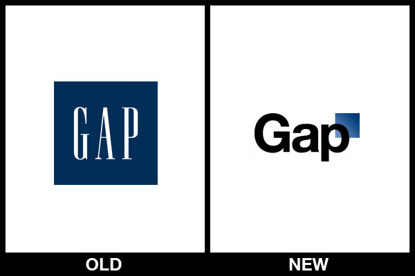
Gap’s rebrand a few years ago is probably one of the most memorable examples of a rebranding disaster.
Following the introduction of the new logo, the brand wasn’t met with the positive response it was expecting. Instead, consumers took to social media sites like Facebook and Twitter to demand that the old logo be reinstated.
After just a few days with the new logo, Gap listened to their consumers and got rid of the new design.
Who knows what Gap were thinking with this design anyway? It looks as though it’s been designed for $20 by someone on a freelancing website with no design expertise at all.
8. Sierra Mist
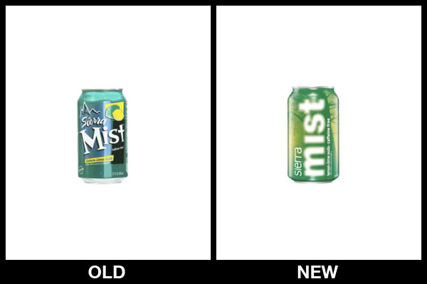
Sierra Mist might not be the absolute biggest and most well-known brand in the world (at least not compared with the likes of Pepsi and Coca Cola) but still, it’s no stranger to the rebranding fiasco.
Sierra Mist’s original branding and logo design was certainly nothing special. It was a rather fun and quirky design that looked a little amateur, yet it managed to define the brand and get it to where it is today.
When Sierra Mist decided to rebrand, they changed absolutely everything. Gone was the quirky fun brand that their consumers loved in favour of a strange misty design that was pretty difficult to read.
It was an amateur design that truthfully, just made it look like every other boring drinks brand out there (which isn’t a good thing).
9. MySpace
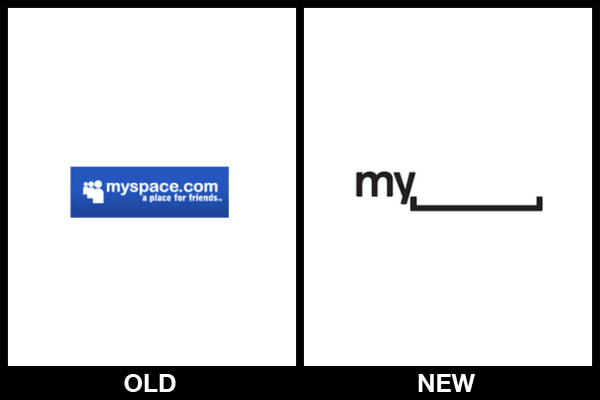
If you cast your mind back to the days before Facebook and Twitter, you might remember the site that started it all; MySpace.
Over the last decade or so, MySpace has been losing members and visitors to its rivals and only recently did it decided to do something about this.
MySpace rebranded the company earlier this year along with a complete overhaul of the site design. Their new logo (on the right) gets a lot of things right; it’s simple, it’s modern and it’s rather elegant.
The problem is that they waited far too long to rebrand and refresh the company’s image. Plus, the new logo isn’t really iconic like the old logo. At least the old logo was memorable and instantly recognisable to anyone older than 15.
10. Wacom
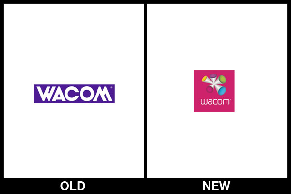
Wacom is probably the world’s most well known manufacturer of graphics tablets and graphic design equipment. However, I’m pretty sure this success cannot be attributed in any way to their terrible logo design.
As you can see from the old Wacom logo, it was pretty simple and iconic. Sure, it looks a little like Yahoo’s logo but still, it was instantly recognisable.
Their new logo on the other hand is anything but simple and iconic. It looks like it’s been designed by a toddler in my opinion. I also have no clue what the image is supposed to represent at all.
11. AOL
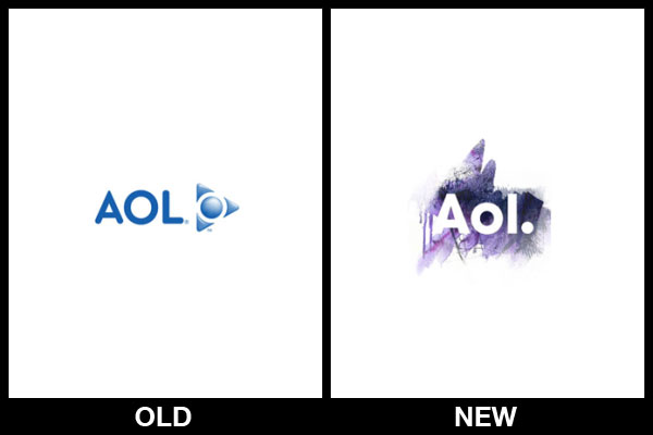
Believe it or not, AOL was once the master of the internet. I can still remember using AOL’s ISP service along with their branded web browser. Sure, this was back in the late 90’s but I remember it, and I’m sure most other people over the age of 18-or-so do too.
Their logo was iconic but much like MySpace, they found that with increased competition, they lost a lot of their market share and fell behind their competitors. Again, much like MySpace, AOL waited far too long to refresh their brand and when they finally did rebrand, their effort was pretty poor as you can see.
To me, this rebrand looks as though someone has scribbled on a piece of paper and rubbed out the word AOL. It’s nowhere near as iconic as the old logo and nowhere near as memorable.
Related Article: The Brand Brief Behind Nike’s Just Do It Campaign
12. NetFlix
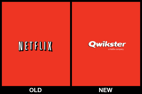
NetFlix might be getting everything right these days but a few years ago, they made a rather foolish mistake.
The CEO of NetFlix announced that the company was going to divide itself into two units; Netflix and Qwikster. The DVD-mailing service would remain NetFlix but the online content-streaming service would be rebranded as Qwikster.
Most customers struggled to understand the move and described the decision as confusing and pointless. Luckily, it only lasted a few months as the CEO soon decided to abandon the plan and leave things as they were.
13. Capital One
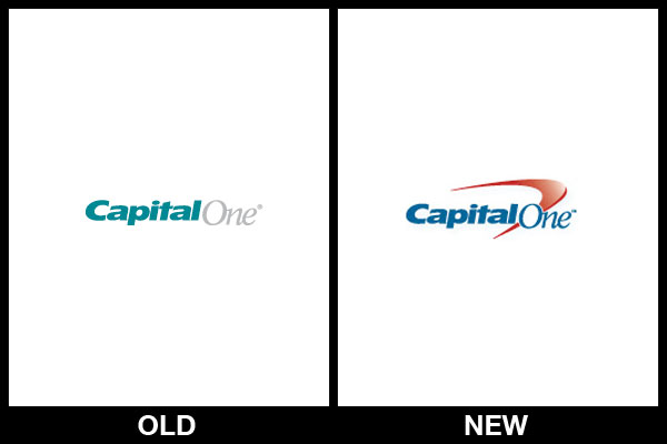
Capital One is a leading credit card provider in the UK and despite already having a clear brand identity, Capital One recently decided it was time for a change.
As you can see from the two logo’s above, very little changed. The typography in the new logo is largely the same as the old logo. However, there is one big difference: a huge red “swoosh”.
The problem here is that the rebrand was not only pointless but only served to complicate the brand identity. Plus, the “swoosh” is iconic for Nike; any other brand that incorporates a “swoosh” into their logo only appears to be mimicking the Nike brand.
14. Best Buy
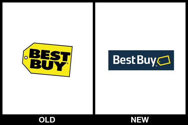
Best Buy introduced their new logo back in 2008 but a few months later, their original iconic logo was reinstated.
I have absolutely no clue what Best Buy were thinking with this one. They replaced an iconic, well-known and bright logo with a dull, pointless redesign. I think the new logo resembles the Pampers brand too.
Best Buy completely lost their brand value with this logo and more importantly, the new logo failed at its most important job; serving as a warm bright light to entice people into their stores.
15. RadioShack
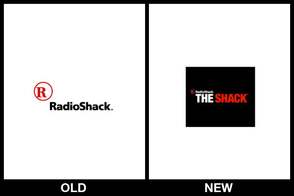
RadioShack is a household name but not too long ago, the company decided it was time to completely rebrand to “The Shack”.
Following the rebrand, RadioShack (or The Shack) spent a massive chunk of its advertising budget (we’re talking millions of dollars) on advertising the rebrand. The idea behind this was to appear trendier and attract a new audience of younger consumers. It was a nice idea but in reality, it just looked like a desperate and misguided attempt at being cool.
Not only was it a terrible idea, but the execution was terrible too. The new logo actually says “RadioShack The Shack”, which makes absolutely no sense at all.
Have any questions regarding your brand? Feel free to send me an email at lowen@peartree.com.au